
Enhancing iOS App Design experience for Thunder Rewards and Thunderstand
Lead Product Designer | Internship
OVERVIEW
Context
As the sole UX Designer and Researcher at Zeta Learning, a California-based startup, my objective was to maintain user engagement with the existing iOS app, Thunder Rewards, while improving the user experience of our soon-to-be-launched app, Thunderstand. Both apps aim to provide personalized and optimized learning experiences for students aged 13-19.
Thunder Rewards
Problem
Our team had the resource-intensive task of shipping physical rewards to users for Thunder Rewards, which needed to be minimized as Thunderstand's launch approached.
Additionally, usability testing for Thunderstand revealed opportunities for improvement in the onboarding process and other areas, and with the launch date quickly approaching, the challenge was to identify and prioritize changes that would have the greatest impact with minimal effort.
Outcome
We informed users of a delay in the shipment of rewards for Thunder Rewards but offered a bonus reward. This included free access to the premium version of Thunderstand for the next two months, which helped redirect many loyal users to the new app.
For Thunderstand, we streamlined the onboarding process by reducing the number of screens and providing quick insights. We also refined the UI elements in the flow to ensure that users can complete tasks effectively.
INFO
Team
Issam Khalloufi
Leina Zoutine
Myself
My Role
UX Researcher,
Experience Designer
Timeline
3 weeks
KEY FINDINGS
Insights based on user research & usability testing
Initially, I utilized Instagram polls and Google survey forms to gather feedback from a significant number of users. After that, I conducted in-depth interviews with ten of our users, hailing from both the USA and the UK, to comprehend their opinions regarding the delay in reward shipment and their experience with the beta version of our new app, Thunderstand.
After combing everything through, these main insights were revealed.
Thunder Rewards
01
Summer slump
Low activity on the app during summer break due to fewer students taking summer school and limited subjects offered.
02
Informed Flexibility
Premium users were understanding of the delay in reward delivery as long as they were informed.
03
Bonus Motivation
Offering a small bonus reward for the delay was effective in keeping users engaged and excited about the app.
Thunderstand
04
Lengthy Pre-Interaction Stage
User research revealed that the pre-interaction stage before reaching the home screen was very long and time-consuming, leading to frustration and reduced user engagement.
05
Improving Task Completion
While the app's user interface was generally effective, research revealed that there were some UI elements that could be refined to better guide users in completing tasks effectively.
06
Time Constraint Limitations
Due to the time constraint, the team had to focus on the most pressing and achievable improvements to the UI, while keeping more ambitious changes in mind for future updates.
RESEARCH
Understanding the problem
Business Constraints
As a small start-up with limited resources and a tight timeline for the new app launch, we needed to find a way to delay shipping rewards for a month without compromising user engagement and app traction. Additionally, we had to quickly iterate and test the new app to ensure a successful launch.
OPPORTUNITY
Thunder Rewards: Delayed Reward Delivery
How might we delay the delivery of rewards to our premium members and still maintain their engagement with the product?
How might we identify the most pressing and achievable improvements to the UI that can be implemented before the soon-approaching Thunderstand launch to ensure a better user experience?
Thunderstand: Prioritizing Achievable UI Improvements
USER STORIES
Understanding the end user's perspective
In order to ensure our team remained focused on creating user-centered products, I took the initiative to create user stories that helped us deeply understand the value of what we were building. By sharing these user stories with the team, we were able to keep the user at the forefront of our decision-making process.
Based on the user interviews, we decided to prioritize the development of two key user stories for Thunder Rewards and two for the Thunderstand app.
Thunder Rewards

"I want to navigate to the new app that is supposed to be my bonus reward real quick, so I don't have to waste time searching for it on the app store."

"I just want to know ahead of time if there are any reward delays, so I don't feel like I'm getting blindsided."
To improve the discoverability of the bonus reward, we can implement easy-to-find breadcrumbs within our app that lead directly to the newly launched app. By providing clear navigation to the new app, users will be able to quickly locate and access the free subscription without having to search for it on the app store.
Enhance the user experience by proactively notifying users of potential reward shipping delays during the summer break period and offering a bonus reward as a token of appreciation for their continued engagement with the app.
Thunderstand

"I want to quickly learn how the app can help me study better so that I don’t waste too much time figuring out what it does."

"I want to be able to easily complete tasks and understand what the app is doing for me as I go through the flow so that I can feel confident and in control while using the app."
To enhance the onboarding experience, we plan to condense the current 11 screens into a concise set of 3-4 screens that effectively communicate the app's value proposition and key features. Our aim is to provide users with a seamless and intuitive introduction to the app, reducing cognitive load and improving user retention.
Based on the usability testing, we aim to optimize the app's value propositions and enhance the user's task completion by identifying minor changes that can improve their effectiveness in using the app.
DESIGN
Building out the Experience
I used the user stories as a basis for creating both low-fidelity and high-fidelity wireframes. Throughout the design process, I conducted frequent testing sessions with all stakeholders. The objective was to find the optimal balance between user needs and project constraints in order to achieve the best possible product outcomes.
Thunder Rewards
Improving Engagement through Compelling Content Strategy

Iteration 1:
Pop-up on the Home Screen
Although the first iteration provided the necessary information to users, it failed to engage them. The goal was to create compelling content that serves as a breadcrumb trail, guiding users to discover and explore the new app. To achieve this objective, we need to implement an effective content strategy that not only informs but also motivates users to take advantage of their "bonus reward." By doing so, we can ensure that users remain engaged and invested in our product.
Visual Design:
Summer Break Mode Icon Design
While reviewing our UI library, I found a summer break icon that lacked inclusive design principles.
Despite facing resource constraints, I recognized the importance of prioritizing inclusivity in our design process. To address this issue, I decided to create a new icon that not only captures the essence of summer break, but also embodies inclusivity in its design.

Iteration 1

Final Iteration
Thunder Rewards
Final Design Solution
Creating a transition experience from normal mode to summer break mode by hinting at what’s coming next.
The user will see the pop-up on the home screen.
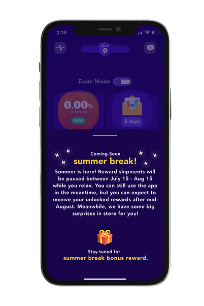
Pop-up on Home Screen
Released 15 days before Summer mode

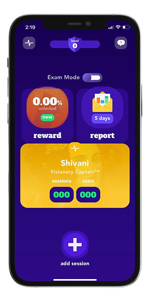
Home Screen (Before)
Summer Break Mode Pop-up on Home Screen


Home Screen
(Summer Break Mode)
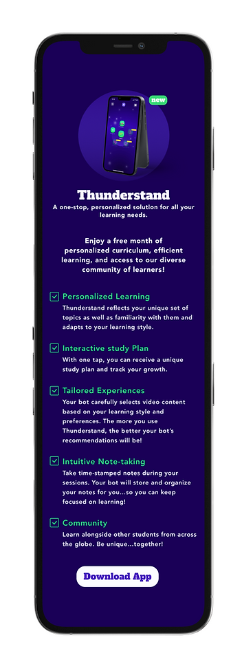
Summer Break Mode Announcement Screen
The ‘download app’ button takes the user to the ‘Thunderstand’ product on the app store.
Thunderstand
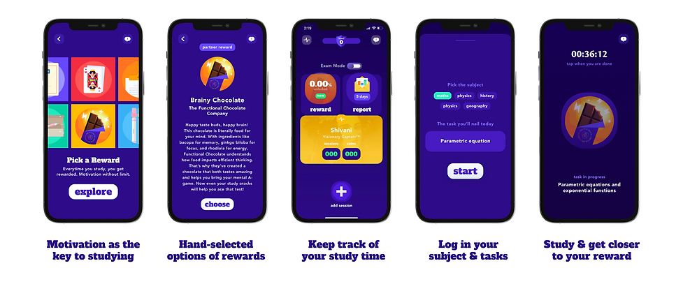
Streamlining the Onboarding process
To achieve this, we can aim to provide users with quick insights into the app benefits within the first 3-4 screens, while also incorporating a user progress indicator to guide them through the flow and build their confidence in the product. By implementing these strategies, we can create a positive user experience that encourages continued engagement with our app.
Onboarding Process


Before

After
Learn and Pivot:
Categorizing and grouping the assessment questions into buckets.
Our current questionnaire comprises 23 questions, which may overwhelm users and make the task seem insurmountable. To address this, we can break down the big task into smaller ones to make the work more manageable and less intimidating. This approach will help users feel in control at every step and achieve "quick wins" as they progress through each category.
This section of the design was delayed for development due to time constraints and low priority

Before
Discover Your Learning Style Quiz

After
The 23 questions were organized into five buckets based on their content.
RETROSPECTIVE
Final thoughts & Takeaways
Usability Testing
ts
6 out of 10 students reported discovering the new Thunderstand app by exploring the bonus reward option within the Thunder Rewards app.
Despite delays in rewards on the app, 2 new members signed up for the Thunder Rewards membership.
All 10 users confirmed that the onboarding screens were more appealing as they contained just the right amount of succinct information.
.
01
Prioritizing tasks and features and adopting an agile approach helped us overcome resource constraints and push changes in a structured manner.
Open and frequent communication within the team was essential for maintaining clarity and avoiding unnecessary delays.
.